


Engineering docs don’t have to be boring. We’ve all written (and skipped reading) those 50-page design docs that are technically accurate but put you to sleep by page 3. This article explores when to lean into storytelling, when to stay technical, and how to find the sweet spot where your docs are both precise and actually readable. Spoiler: it’s not an either-or choice.
If you like written articles, feel free to check out my medium here: https://medium.com/@patrickkoss
The Document Nobody Reads
Picture this: You’ve just spent three weeks writing the most comprehensive design document of your career. Every edge case covered. Every diagram perfect. Every API endpoint documented. You hit “publish” and wait for the feedback to roll in.
Instead, you get two comments. One is “LGTM” from someone who definitely didn’t read it. The other is “Can you add a summary at the top?”
Sound familiar?
Here’s the uncomfortable truth: technical documentation has a reading problem. Not a writing problem. A reading problem. Your 5,000-word architecture spec might be flawless, but if nobody makes it past the introduction, it might as well be blank. The document sitting in your wiki gathering digital dust isn’t failing because it lacks detail. It’s failing because it lacks a pulse. As one analysis notes, technical reports “provide specificity, expertise, and instruction” but “often lack in approachability and human perspective” [1].
The weird part? We know how to write stuff people actually want to read. We do it every day in Slack, in code review comments, in postmortem reports that people pass around saying “you have to read this one.” Those documents work because they tell a story. They have stakes. They have a beginning, middle, and end. They make you care.
So why do we abandon that when writing “official” documentation? Why does the API reference have to read like a legal contract? Why does the onboarding guide sound like it was written by a committee of robots? After all, Wikipedia itself notes that “since the purpose of technical writing is practical rather than creative, its most important quality is clarity” [2]. But clarity and engagement aren’t mutually exclusive.
The answer isn’t to turn every doc into a novel. That would be ridiculous. But there’s a massive gray area between “50 Shades of Technical Specs” and “A Tale of Two Microservices” where most of our documentation could live. This article is about finding that zone.
Why Your Brain Hates Walls of Text (But Loves Stories)
Let me tell you about the time I inherited a codebase with 200 pages of documentation. Beautiful documentation. Tables of contents, diagrams, the works. Six months later, I still had no idea how anything worked. The docs were comprehensive, but they were also completely impossible to absorb.
Then I found a three-page “war story” document someone had written about a production incident. In twenty minutes of reading, I learned more about the system’s actual behavior than I had in months of reading the official docs. Why? Because the story gave me context. It showed me cause and effect. It walked me through a real scenario where decisions mattered and had consequences.
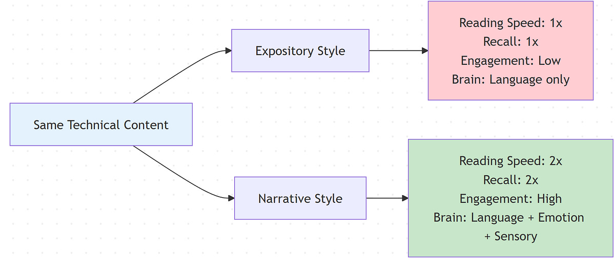
Your brain is wired for this. Thousands of years of evolution optimized us for narrative, not bullet points. When someone tells you a story, your brain lights up like a Christmas tree. Language processing, sure, but also emotion centers, sensory regions, even motor cortex areas that fire when you imagine doing the actions being described [1]. A story doesn’t just inform you. It simulates an experience.
Studies back this up. A massive 2021 meta-analysis covering over 33,000 participants found that stories are significantly easier to understand and recall than expository essays [3]. Narrative text gets read about twice as fast as expository text. It gets recalled twice as well too [4]. Not 10% better. Twice. That’s not a marginal improvement. That’s a completely different league of effectiveness. And this isn’t just for non-technical topics. It holds true whether you’re explaining how cookies work or how Kubernetes schedules pods [4].
The magic happens because stories provide structure that matches how we think. We understand time. We understand causality (this happened, so that happened). We understand problems and solutions [5]. When you frame your technical content in that structure, comprehension becomes effortless. When you don’t, readers have to work overtime just to figure out what connects to what.
Here’s a quick test. Which of these would you rather read:
“We migrated from monolith to microservices. We implemented service mesh. We updated deployment pipelines.”
Or:
“Our API was dying under load. Every request took 3 seconds. We were hemorrhaging users. That’s when we decided to blow up the monolith and see if microservices could save us. Spoiler: it got worse before it got better.”
Same information. Wildly different engagement. The second version makes you want to know what happened next. The first version makes you want to check Twitter. As one engineer notes, framing technical work as a problem with context and conflict makes the narrative “more compelling, and people will want to hear the results and lessons learned” [8].
The kicker? Adding that narrative structure doesn’t make your docs less accurate. It makes them more useful. Because a document nobody reads has an accuracy of zero.
If you made it this far, consider clapping and following. It´s free and helps me a lot.
When to Stay Dry (And When to Bring the Drama)
Not every document deserves a plot twist. I learned this the hard way when I tried to make our API reference “fun” by adding jokes and anecdotes. The feedback was… not positive. Turns out when you’re frantically looking up which HTTP status code means “gateway timeout,” you don’t want to read a paragraph about that time the author’s microwave caught fire.
The secret is matching your style to the document’s job. Different docs serve different purposes. Some are meant to be scanned. Others are meant to be absorbed. Here’s how I think about it.
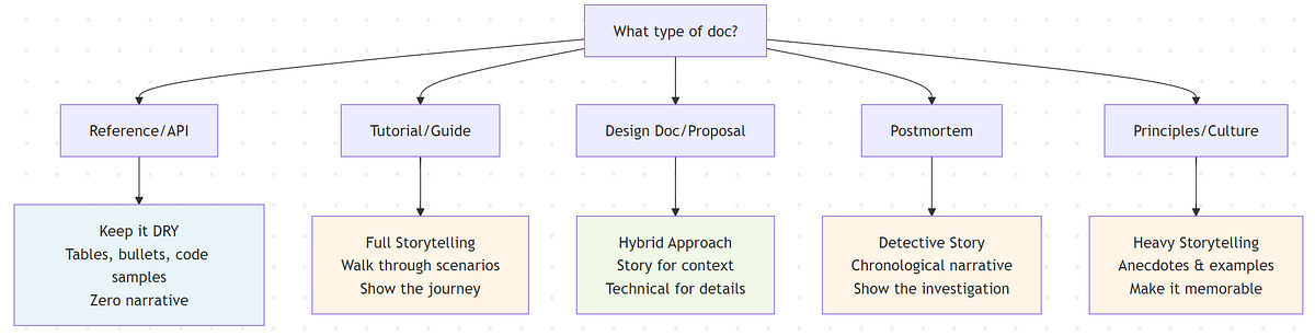
Reference docs and API specs are like dictionaries. Nobody sits down to read a dictionary cover to cover (okay, almost nobody). You look up the word you need, get the definition, and move on. These documents should be ruthlessly organized, searchable, and to the point. Tables, bullet lists, code samples. Zero narrative. Any attempt to be clever here just gets in the way. As the Diátaxis documentation framework notes, users consult reference material “for accurate information rather than reading it like a narrative” [6]. Keep it factual, structured, and searchable.
Tutorials and onboarding guides are like cooking shows. Ever watch Gordon Ramsay teach someone to cook? He doesn’t just list ingredients and steps. He walks you through it. “First we’re gonna sear this, see how it gets that crust? That’s what you want.” Tutorials benefit massively from that narrative approach. Set up a scenario. Walk through it step by step. Explain why each step matters. Make it feel like someone’s sitting next to you showing you the ropes. In fact, the Diátaxis framework explicitly designs tutorials as a form of storytelling, “providing a narrative that addresses a larger objective” [6]. These docs should absolutely tell a story because you’re taking someone on a journey from “I have no idea” to “I just built something.”
Design docs and architecture explanations live in the middle. They need technical precision, but they also need to convince people. I’ve seen brilliant designs shot down because the author couldn’t explain why anyone should care. Start with a story. “Here’s the problem we’re facing. Here’s what happens if we do nothing. Here’s what we’re proposing.” Then dive into the technical details. Then bring it back to impact. Sandwich the dry stuff between layers of narrative context.
Postmortems are crime scene investigations. The best postmortems read like detective stories. “At 2:47 AM, service X started throwing 500s. At first we thought it was a deployment. Then we noticed the database was screaming. By 3:15, we realized…” A chronological narrative makes the incident memorable and helps everyone understand not just what broke, but how the failure cascaded. In fact, many postmortem templates explicitly require a timeline section that should “provide a narrative, essentially retelling the story from start to finish” [7]. These documents should absolutely be stories because that’s how humans process and learn from mistakes.
Engineering principles and culture docs need soul. Nobody remembers a list of values. They remember the story about the time someone stayed up all night to fix a bug before launch, or the meeting where someone said “this violates our principle of X” and everyone nodded because they got it. If you’re writing about culture or principles, ground every single one in a concrete example or anecdote. Otherwise it’s just corporate word salad.
The pattern here? If someone needs to find a specific fact quickly, keep it dry. If someone needs to understand, remember, or be convinced of something, add narrative. And for everything in between, use both. Start with story to hook them and provide context. Then deliver the technical goods. Then wrap back to impact and takeaways.
One more thing: even in the driest docs, examples are mini-stories. A code sample with a comment like “// User just logged in, now we need to fetch their profile” is more helpful than the same code with “// Fetch user profile.” Context is story. Use it everywhere.
The Anatomy of Engineering Storytelling
Let’s get practical. What does “storytelling” actually mean in engineering docs? It’s not flowery language or creative writing. It’s structure. It’s showing instead of telling. It’s giving your reader a protagonist (even if that protagonist is a user, a system, or a bug).
Every good story has three ingredients: a character, a problem, and a resolution. In engineering docs, this maps perfectly to our work. The character is a user, a system, a team. The problem is a bug, a constraint, a business need. The resolution is your solution, your decision, your approach.
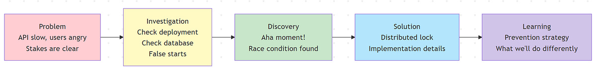
Here’s a real example. I once wrote a post-mortem about a cache invalidation bug that took down our API. I could have written: “Cache invalidation logic had a race condition. We fixed it by adding a distributed lock.” Accurate. Boring. Nobody’s learning from that.
Instead I wrote it like this: “At 3:47 PM on a Tuesday, our API response time went from 200ms to 8 seconds. Users started rage-tweeting. Our monitoring went red. We rolled back the last deploy. Nothing changed. That’s when the real panic set in.” Now you’re hooked. You want to know what happened. So I walked through the investigation, the false starts, the eventual discovery of the race condition, and the fix. People still reference that postmortem two years later.
The structure was: problem (slow API, angry users), investigation (the detective work), discovery (the aha moment), solution (the fix), and learning (how we prevent it next time). That’s a story arc. It’s also just… good documentation. It shows causality. It shows process. It makes the lesson stick.
Another technique: use specifics, not abstractions. Don’t say “performance degraded.” Say “response time went from 200ms to 8 seconds.” Don’t say “we improved the algorithm.” Say “we shaved 2 million rows out of the query and it went from timing out to returning in 50ms.” Numbers and details make things vivid. Vivid things are memorable.
Analogies are another secret weapon. Ever tried explaining eventual consistency to a non-technical person? “It’s like when you post on social media and your friend in another country sees it a few seconds later. The data has to travel.” Boom. Instant understanding. Use analogies in your docs. Compare your database architecture to a library’s card catalog system. Compare your CI/CD pipeline to an assembly line. If it helps someone visualize what’s happening, use it.
One pattern I love is the “failure story first” structure. Start with what happens if you do it wrong. Show the pain. Then introduce your solution as the hero. Example: “We used to deploy on Fridays. Then one Friday at 4:47 PM, a deploy took down checkout. We spent the weekend rolling back while losing six figures in revenue. Now we have a deploy freeze from Thursday noon to Monday morning.” That story makes the rule memorable. Without it, “don’t deploy on Fridays” is just another policy.
The goal isn’t to entertain. The goal is to make your documentation impossible to forget. Effective technical storytelling still upholds truth and accuracy, it’s just framed in a way that resonates [8]. Story structure does that. It gives your reader a mental peg to hang information on.
When “But Actually” Ruins Everything
There’s a trap I see in a lot of technical writing. The “balanced take” trap. Every point gets a counterpoint. Every benefit gets a caveat. Every solution gets a “but on the other hand.” It makes the writing feel like a seesaw. Back and forth, back and forth, until the reader is dizzy and has no idea what you actually think.
Here’s permission to have an opinion. You don’t need to give equal time to every perspective. If you think approach A is clearly better than approach B, say it. Explain why. Give evidence. But don’t feel obligated to write three paragraphs about how approach B might work in some alternate universe.
I learned this writing a design doc for a database migration. I initially wrote this very diplomatic, very balanced analysis of three different approaches. In the review, someone wrote: “Which one do you actually recommend?” I realized I’d spent so much effort being fair that I forgot to be useful. In the next draft, I led with: “We should use approach A. Here’s why.” Then I addressed the alternatives only to explain why we weren’t picking them. Suddenly the doc had a point of view. People could agree or disagree, but at least they knew where I stood.
This doesn’t mean ignoring tradeoffs. Good docs acknowledge limitations. But there’s a difference between “this solution has X drawback, which we mitigate by Y” and “well on one hand this, on the other hand that, who can really say.” One is honest. The other is wishy-washy.
Same goes for emotion and opinion. You’re not a robot. If something surprised you, say so. If something frustrated you, mention it. If you think a certain pattern is elegant, call it out. That color makes your writing feel human. It gives readers something to connect with.
I once read a tech blog post that started: “Kubernetes is supposed to make your life easier. It did not make my life easier. Let me tell you about the week I lost to a single YAML typo.” That hook worked because it was honest and relatable. Nobody wants to read sanitized corporate-speak. They want the real story.
Vary your sentence length too. Short sentences hit hard. They make points punchy. Longer sentences let you build up momentum and explore an idea more fully, drawing the reader along as you connect multiple thoughts into a coherent thread. Mix them up. Create rhythm. If every sentence is the same length, your writing turns into a monotone hum. You can hear it when you read aloud. That’s your test. If it sounds like a robot wrote it, rewrite it.
The Biggest Mistake: Writing Before Thinking About Your Reader
I used to write docs for an imaginary “future me.” I’d brain-dump everything I knew, organize it logically (by my own logic), and ship it. Then I’d be shocked when people had questions that I thought the doc answered. The problem wasn’t the content. The problem was I wrote for myself, not for my audience.
Now I start every doc by asking: who’s going to read this, and what do they need from it? A junior engineer onboarding? They need context and examples, not just facts. A senior engineer evaluating an approach? They want the tradeoffs and the reasoning. A product manager trying to understand technical constraints? They need analogies and impact, not implementation details.
Same topic, totally different docs.
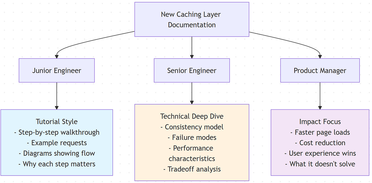
Here’s a test case. Let’s say you’re documenting a new caching layer. For the junior engineer, you might walk through an example request showing exactly where the cache checks happen and why. Include diagrams. Explain the basics. For the senior engineer, you’d focus on the consistency model, failure modes, and performance characteristics. For the PM, you’d talk about what this enables (faster page loads, reduced infrastructure cost) and what it doesn’t (it won’t magically fix slow queries).
I saw this done brilliantly at a previous job. Our documentation was structured in layers. “Getting Started” was pure tutorial, story-driven, hand-holding. “How-To Guides” were task-focused for people who knew the basics. “Architecture” was for senior folks who wanted the deep dive. “Reference” was the dry stuff. You could enter at whatever level matched your needs. Nobody had to wade through irrelevant content.
Another key: don’t bury the lede. Start with the most important thing. If you’re proposing a migration, lead with “We’re migrating from X to Y, it’ll take 3 months, here’s why we have to do it.” Don’t make people read 10 paragraphs to figure out what the document is even about.
And for the love of all that is holy, add a TL;DR at the top. Some people want the full story. Others need the headline. Give them both. A good TL;DR isn’t a cop-out. It’s a courtesy. It says “here’s the punchline, read on if you want the details.” That respects your reader’s time.
One pattern I love: progressive disclosure. Start high-level. Then go deeper. Structure your doc so someone can read the first section and walk away with the gist, or keep reading to get more detail. Kind of like a news article. Headline, lede, then the full story [1]. That way you serve skimmers and deep readers with the same document.
Shipping Documentation That People Actually Want to Read
Let’s bring this home. You’ve got a blank page. You need to write a design doc, a tutorial, a postmortem, whatever. How do you make it something people will actually read and remember?
Start with the problem. Not the solution. Not the technology. The problem. Who’s affected? What’s at stake? Why does this matter? Hook your reader with something concrete. “Our deployment process is slow” is abstract. “Last quarter, we shipped 30% fewer features than planned because deployments took 4 hours” is a problem with teeth.
Tell the story of your investigation or decision process. Don’t just present the final answer. Show the path you took. What did you try first? What didn’t work? What made you change direction? This does two things: it makes the doc more engaging, and it teaches your reader how to think through similar problems. The journey is the lesson.
Use real examples. Lots of them. Code snippets. Screenshots. Diagrams. Command outputs. Don’t just describe what happens. Show it. A good example is worth a thousand words of explanation. When I’m writing a how-to, I literally do the thing I’m documenting and copy-paste the actual output. It’s authentic and it’s precise.
Inject personality. Not jokes for the sake of jokes, but genuine human voice. Write like you’re explaining this to a colleague over coffee. “So basically what happens is…” or “Here’s where it gets weird…” or “This part drove me crazy until I realized…” Those phrases aren’t unprofessional. They’re relatable. They make your writing feel like it came from a person.
Structure matters. Break up walls of text with headings. Make your headings descriptive so people can scan. Use short paragraphs. Give people visual breathing room. A dense block of text is intimidating. White space is inviting.
End with takeaways. What should the reader remember? What should they do next? If it’s a design doc, end with next steps and open questions. If it’s a tutorial, end with “now you know how to X, next you might want to explore Y.” If it’s a postmortem, end with the specific changes you’re making to prevent recurrence. Give closure.
And here’s a pro move: read your doc out loud before you ship it. Seriously. If it sounds robotic or awkward when spoken, it’ll read robotic and awkward. If you stumble over a sentence, it’s too complex. Simplify it. Your writing should flow like speech (polished speech, but speech).
Finally, iterate. Your first draft will be rough. That’s fine. First draft is for getting ideas down. Second draft is for structure. Third draft is for clarity and voice. Most people ship their first draft and wonder why it doesn’t land. Give yourself time to revise. The difference between okay docs and great docs is usually just one more editing pass
Conclusion
We started with a problem: technical documentation that’s accurate but unreadable. We explored why storytelling works (brain science), when to use it (tutorials, postmortems, design docs) versus when to stay dry (API references), and how to actually do it (structure, examples, voice).
Here’s the real insight: storytelling and technical accuracy aren’t opposites. They’re partners. The best documentation uses narrative structure to make technical content memorable and uses precision to make stories credible. You don’t have to choose between readable and rigorous. You can have both.
The docs people actually read and remember are the ones that respect how humans think. We don’t process information in isolation. We need context, causality, and connection. Give us a story and we’ll follow you anywhere.
Next time you sit down to write a design doc or tutorial, try this: start with a real problem, walk through your thinking process, use specific examples, and write like you’re talking to a smart colleague. See how it feels. I bet it’ll be better than what you would’ve written otherwise.
Because at the end of the day, a brilliant technical document that nobody finishes is just a bunch of bits taking up space in your wiki. But a doc that’s both accurate and engaging? That’s the kind of artifact that gets passed around, referenced in Slack, and actually influences how your team builds software.
Make your docs worth reading. Your future self (and your teammates) will thank you.
References
[1] Kittelson & Associates (2023). Elevating Technical Reports through Storytelling. https://www.kittelson.com/ideas/the-plot-thickens-elevating-technical-reports-through-storytelling-techniques/#:~:text=Kittelson%E2%80%99s%20team%20of%20technical%20writers,Read%20on%20to%20find%20out
[2] Wikipedia. Technical writing. https://en.wikipedia.org/wiki/Writer#:~:text=also%20write%20different%20procedures%20for,to%20the%20relevant%20style%20guide
[3] Mar, R. A., et al. (2021). Memory and comprehension of narrative versus expository texts: A meta-analysis. Psychology (York University). https://pmc.ncbi.nlm.nih.gov/articles/PMC8219577/#:~:text=conducted%20a%20meta,This%20finding%20has
[4] Dahlstrom, M. F. (2014). Using narratives and storytelling to communicate science with nonexpert audiences. PNAS 111(Suppl 4). https://spcomics.com/digestables/j91wt88e1e8zbbi4xz0hrovtjo0c8h#:~:text=scientific%20processes%20or%20present%20programmatic,elements, https://www.uvm.edu/~mjk/195%20Winter%20Tracking%20Specialty/Using%20narratives%20and%20storytelling%20to%20communicate%20science%20with%20nonexpert%20audiences.pdf#:~:text=often%20associated%20with%20increased%20recall%2C,be%20assumed%20to%20come%20from
[5] Narrative and Exposition. University of Vermont. https://www.uvm.edu/~mjk/195%20Winter%20Tracking%20Specialty/Using%20narratives%20and%20storytelling%20to%20communicate%20science%20with%20nonexpert%20audiences.pdf#:~:text=reasoning%2C%20whereas%20the%20utilization%20of,In%20contrast%2C%20narrative
[6] Diátaxis Documentation Framework. Tutorial vs Reference documentation types. https://blog.dask.org/2022/07/15/documentation-framework#:~:text=,and%20outputs%20of%20a%20particular, https://edify.cr/insights/streamlining-technical-documentation-with-diataxis-framework/#:~:text=components%2C%20such%20as%20APIs%2C%20classes%2C,users%20operate%20the%20machinery%20effectively
[7] Incident.io. Incident post-mortem template. https://incident.io/hubs/post-mortem/incident-post-mortem-template
[8] Rebrović, M. (2018). Storytelling in design and engineering. https://merlin.rebrovic.net/blog/storytelling-in-design-and-engineering/#:~:text=For%20example%2C%20if%20you%20say,the%20results%20and%20lessons%20learned


